Anatomy of a manga page: panels, speech bubbles, reading direction
How does a manga page read? Panels, gutters, bubbles, captions, sound effects, screentones and bleeds: everything that makes a page work.
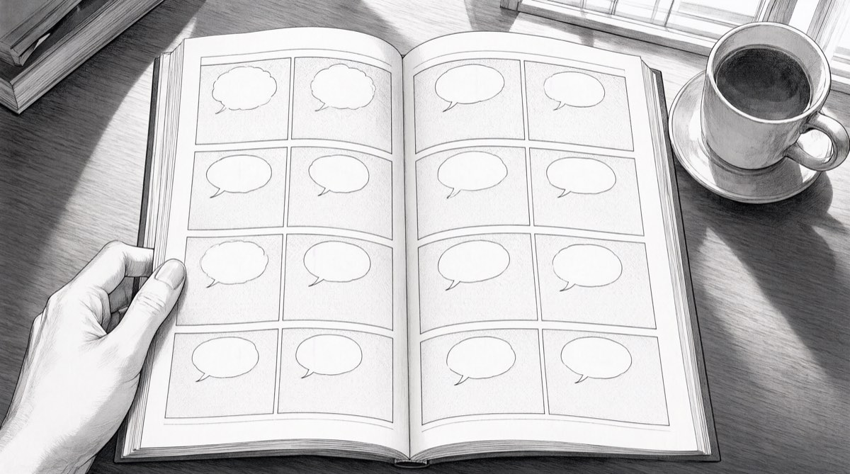
A manga page seems obvious: you read it in a few seconds without thinking. That is precisely the sign it is well made. Behind it is precise machinery: panels of chosen sizes, a path for the eye, bubbles placed in order, greys that give the light. Understanding that machinery helps you read, and above all write, because a layout is decided before the first stroke.
Reading direction
A Japanese manga reads from right to left, because Japanese is written that way: you open the book at what would be, for us, the last page, and in each page you start at the top right. Western publishers long flipped the pages in mirror image; since the 2000s, they publish in the original direction, with a warning at the end of the volume.
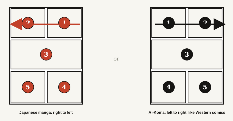
The pages produced by Ai-Koma read from left to right and top to bottom, like a Western comic: the layout is written in that direction, and the bubbles are placed accordingly. If you want a Japanese direction for a project, it is not an option yet; tell us, we are measuring demand.
The panel: one moment, one framing
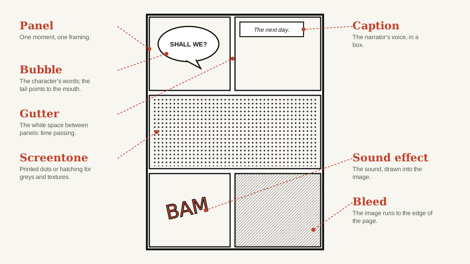
The panel is the basic unit. It holds a single moment and a single framing, exactly like a shot in film: wide shot to set a place, medium shot for a conversation, close-up for an emotion, high angle to crush, low angle to magnify. A good layout changes framing at every panel; two identical panels in a row is one panel too many.
The size of the panel is time. A large panel, the reader lingers: an arrival, a landscape, a shock. A run of small panels, the reader speeds up: a quick exchange, a brawl. A mangaka thinks of the page as a score, with strong beats and silences.
The shape tells the intention. Rectangular panels are calm; diagonals create imbalance and energy, hence their use in shōnen; blurred or absent edges signal a memory, a dream, a feeling.
The gutter: where time passes
The white space between two panels is called the gutter. It looks empty; that is where everything happens. Between a panel where a character raises an arm and one where the other is on the floor, the reader has imagined the blow themselves. The wider the gap between the two images, the harder the gutter makes the imagination work: the theorist Scott McCloud calls this “closure”. A well-made layout chooses what it does not show.
Speech bubbles: words staged
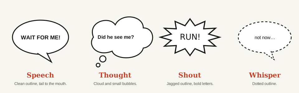
The bubble (fukidashi) holds the words, but its shape already plays them. A clean round outline for ordinary speech; a cloud with small bubbles for thought; a jagged outline and heavy letters for a shout; a dotted line for a murmur; a trembling outline for fear; angles for a mechanical voice or a radio. The tail of the bubble points to the mouth of the speaker, and the order of the bubbles in the panel follows the reading direction: the first at the top left (for us), the last at the bottom right.
A writing tip that counts double with a generated drawing: short bubbles. One or two brief sentences per panel, rarely more than ten words. Long speeches weigh the page down, and image models, like hurried letterers, make mistakes in long texts.
The caption: the voice from above
The caption is a box, usually in a corner of the panel, that carries what no character says: the place, the time, a passage of time, the narrator’s voice. “The next day.” “Tokyo, 11:40 pm.” “She no longer believed it.” It is precious for ellipses: a caption and a gutter replace a page of explanation.
Sound effects: sound drawn
In Japan, sound effects are an art. They are not laid on the image, they are part of it: letters distorted by speed, dissolved in smoke, broken by impact. DOKI DOKI for a racing heart, GOGOGO for rising tension, SHIIIN for silence (yes, silence has a sound). Western publishers sometimes translate them, often leave them, and explain in the margin. In an Ai-Koma page, they are drawn like the bubbles, in your language or in universal letters (BAM, CRACK, TAP TAP).
Screentones: greys and textures
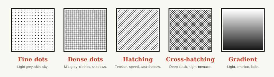
Manga is drawn in black, without washes. To obtain grey, skin, a sky, a shadow, the artist sticks down a screentone: a transparent sheet printed with dots or lines, cut with a craft knife to the required shape. Fine dots make a light grey, dense dots a mid grey, hatching a tension or a speed, cross-hatching a deep black, gradients a light or an emotion. Shōjo backgrounds, flowers and stars, are screentones. Today all of this is applied digitally, but the eye still recognises the grain.
The bleed: when the image overflows
A panel that runs to the edge of the page, with no margin or frame, is called a bleed. It steps out of the grid, and therefore out of normal time: this is the strong moment, a character’s arrival, the landscape being discovered, the revelation. To be used sparingly, about once per chapter, or it stops surprising.
A page drawn by Ai-Koma, taken apart
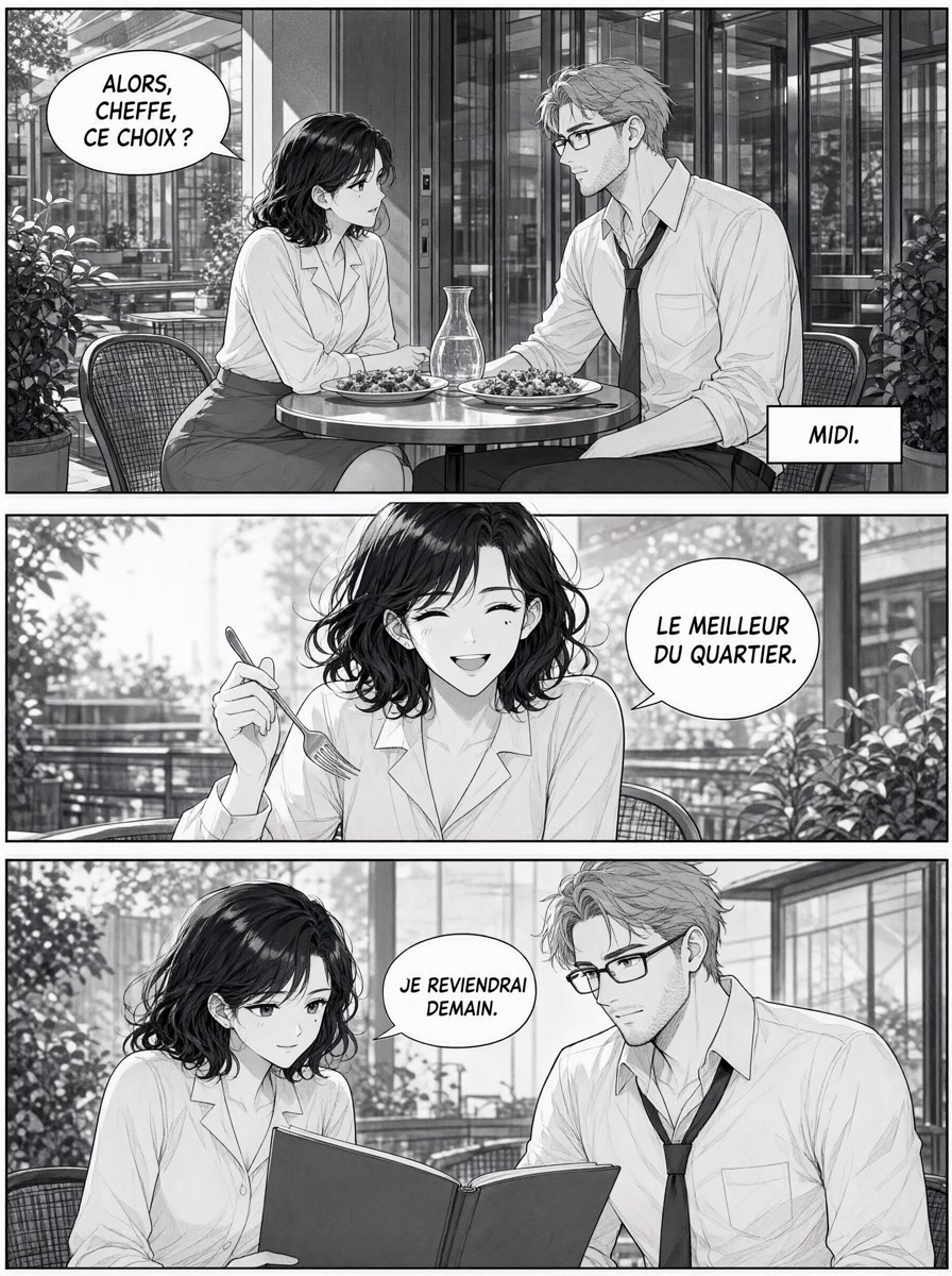
Look at this page produced by the studio (in French, bubbles included). Three horizontal panels, so a calm rhythm. First panel: wide shot, the place, the two characters, a bubble that asks the question, a caption for the time. Second panel: close shot on her, the laugh; the panel is the largest of the three, because it is the moment to keep. Third panel: medium shot, the two together, bent over a book, and the promise “I’ll come back tomorrow” that makes the punchline. Screentones make the greys of the clothes and foliage; the bubbles are short; the eye goes from left to right without ever hesitating. That is the whole work of the layout, written by the text model and reviewed by the author before the drawing.
To write your own layout
- One panel = one moment + one framing. Change framing at every panel.
- Give the large panel to the moment that counts; the small ones to what goes fast.
- Cut between the panels what the reader can imagine alone.
- Short bubbles, one speaker per panel, the caption for time and place.
- One bleed per chapter, no more.
Next: the complete method to write a manga without knowing how to draw.
The illustrations in this article were drawn by Ai-Koma from descriptions written by the team; they depict no real person.
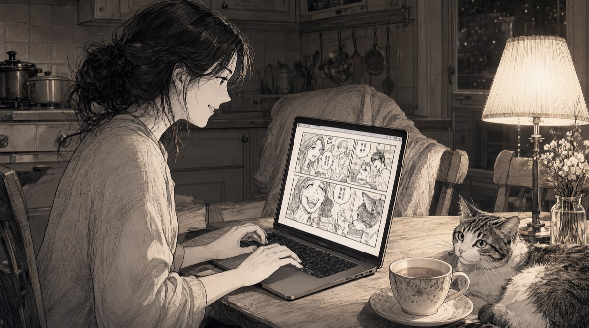 How to write a manga without knowing how to draw: the five-step method
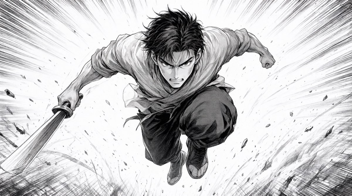 Shōnen, shōjo, seinen, josei: the main manga styles and how to recognise them
 Manga vocabulary: the 30 words you need to know